Graphics and the Internet
Seven New Deadly Internet Graphic Sins
Thanks to the response to last month’s column, we’re doing it all again. Here are seven more Web design sins!
1. Mailbox Images
I don’t know why I don’t like these, but I especially don’t like the animated ones. If you want people to contact you, just write “E-mail me at yourname@yourwebsite.com.” It’s much neater.
|
|
2. Looney Tunes
“Music on Web sites is the Internet equivalent of pan-pipe elevator Muzak.” That was a quote, by me, just now, on what I think about music on Web sites. I couldn’t find a real quote—sorry!
This isn’t strictly a graphic sin, but lots of people e-mailed me to tell me of their hatred for people who make you listen to badly composed MIDI music while browsing their Web sites. Put simply, MIDI is a way of storing tunes using a very small amount of space. The small size makes it ideal for use on the Internet. The trouble is that it makes any tune sound like it’s being played on a cheap Casio keyboard. So what are my objections? First, the tunes take too long to download. Second, they rarely add anything of value to the page. (Yes, I agree that the Internet could be a wonderful multimedia experience incorporating graphics, video and sound—but please wait until the technology catches up and we can enjoy these things without any speed loss.) Third, there’s never any warning. Imagine surfing away in the dead of night. Everything is quiet. Shhhhhh! Very quiet. Then, all of a sudden, blasting through your speakers comes a MIDI version of “Stairway to Heaven.”
If you absolutely have to have music on your Web site, please give us the choice to turn it on rather than make us hunt around for the option (if any) to turn it off.
My final point on this subject has to do with copyright. (We covered copyright in part one of this series.) Remember, if you use other people’s songs on your Web site without their permission you are technically breaking the law. Remember Napster? Metallica and their industry friends took Napster to court for violating their copyright. If that’s what happens for infringing copyrights, what would they do to you for not only copying their songs but also making them sound like bloody rubbish?
If you want, you can find out more about MIDI and listen to some music that doesn’t sound too bad. I won’t pick out a Web site containing bad music, as I don’t want to make an example of a single case. I’m sure if you run a search on Google for “really bad MIDI music on home pages” something will turn up.
3. Not Finding the Spel Chekker
Just about evry HMTL creaytor has a spel chekker. Find it and yooz it. Unsure about a spelling? Visit Dictionary.com.
4. Using an Image for a Lot of Text
Some Web sites use graphics in place of text. Now, I’m not talking about headings and small items of text here, I’m talking great big passages of text.
|
|
Using a graphical image as a header is fine—it livens the page up. If no one used graphics for this type of text then most Web sites would look like they were designed in 1996. What annoys me is when a large passage of text is entered on the page as a graphic. For example:
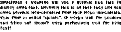 |
Text loads in an instant and uses very little memory. Pictures, on the other hand, can take up considerable room. Furthermore, you cannot use a computer to search text stored as an image. If, for instance, you were going to try to search for an occurrence of “Woman Weeping” in a piece about Picasso, well that’s just tough! You can forget about search engines spidering your site effectively, too.
5. Pages that Go On and On and On and On
If you have a lot of text on your Web site then split it up over several pages. Text is difficult to read on monitors as it is; if you break it down in manageable chunks, visitors will be more inclined to read it.
On a similar note, If you have lots of pictures to show, don’t stick them all on the same page, as it will take ages to load. One option is to make thumbnails of the images (i.e., smaller versions of the pictures), presented such that when a visitor clicks the image he will be taken to the bigger picture. Make sure that your thumbnail is a physical reduction in size of the image rather than a reduction using HTML, or it won’t make any difference in the load time. If you don’t like thumbnails, you could make a slide show. Take a look at the example below.
 |
6. How do I Get in?
Sometimes I’ll visit a site on, let’s say, shoes. I’ll type the address into my browser of choice and await a load of information on shoes. The page loads up. What do I see?
- A big logo: “Steve’s Shoe Web Site.”
- Lots of banner ads: about twelve for some banner exchange and a couple for some other shoe sites.
- An affiliate link to Amazon.com, for books about shoes.
- A big mailbox, next to the words: “E-mail me today, sign my guestbook, and join my mailing list!”
The problem is that the entrance into the main site is through a small text link down at the foot of the page. You might be able to find it, but that’d be because you’re the one who put it there. Get some other people to check your site. Make sure that navigation is easy, and make sure that you can get to all the main pages from every page on your site. Remember that your visitors won’t always enter your site from the main index page. Think of every page as a possible entry point.
7. Tiny Text
We touched on this last month, and it remains a big bone of contention among our readers. This is also a “sin” of which even we at ATPM are a little bit guilty. So, starting with this issue, we’ve changed the way we specify fonts in our style sheet. The best advice here is to check your Web site on as many different browsers and platforms as possible. Good luck!
• • •
Next month we’ll be looking at the PNG graphic file format.
![]() Copyright © 2000 Grant Osborne,
gosborne@atpm.com.
Copyright © 2000 Grant Osborne,
gosborne@atpm.com.
Also in This Series
- PNG · December 2000
- Seven New Deadly Internet Graphic Sins · November 2000
- Seven Deadly Internet Graphic Sins…or Things That Look Really Bad on Web Pages · October 2000
- The Animated GIF · September 2000
- The GIF File Format · August 2000
- Banner Advertisements · July 2000
- JPEGs and JPEG Compression · June 2000
- Help, I Can’t Draw! · May 2000
- Copyright · April 2000
- Complete Archive
Reader Comments (2)
Please! Let the whole article load, even if it's long. We can start reading while the rest gets downloaded. Reading further in the article is a simple page down, not the click-wait-wait-read process.