Graphics and the Internet
Seven Deadly Internet Graphic Sins…or Things That Look Really Bad on Web Pages
This month I’m taking a lighthearted look at things that don’t always work on Web pages. Please don’t take it to heart if this article describes your own Web site. It’s just a bit of fun, and shouldn’t put you off using some of the ‘effects’ if you really want to! I’m going to take this opportunity to thank Raena Armitage for giving me a whole bunch of ideas.
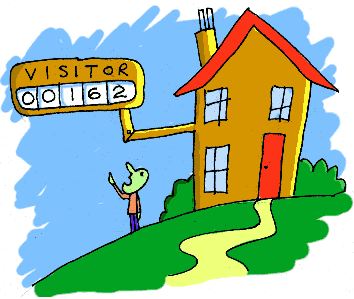
Graphic Sin #1: Counters
It’s a common sight on many homepages. “This site has received [00133] hits since January 1998,” or if you are really lucky, you may see: “This site has received [Counter is broken, please check your HTML code] hits since January 1998.”
 |
Often you’ll come across a homepage with a counter the size of a baby elephant that just completely fills half the page. Maybe if the person put some actual content in this space he would receive more visitors. Just a thought.
There are two main reasons why you would want to put a counter on a Web site:
- To see how many hits you’re receiving.
- To stroke your own ego.
If you want to accurately record the visitors to your site, then a counter is not the answer. A counter records the requests for a particular image on your site, not the individual visitors. A counter won’t take any notice of visitors entering your Web site from a page other than the page the counter is on. If you want detailed stats on the visits to your Web site, there are many free stat programs available. Check out Superstats or Hitbox.
If you want to stroke your ego and show everyone that you’ve only had 10 visitors in the last year, then so be it. If your site is getting loads of visitors then give yourself a pat on the back and use that counter space to sell some banner advertising or something!
 |
My main gripe with counters is that they are often inaccurate and take up space that could be used for something else. Remember that the first page your visitor sees is your only chance to make that first impression, so concentrate on the good content. If you really want a counter, visit thecounter.com, which offers an invisible counter and allows only you to access the information.
Graphic Sin #2: Scary Looking Page Dividers
If you need to divide up some text, then make it tasteful.
|
|
This isn’t tasteful. Go and check out how books and magazines divide up bits of text. Maybe put the background in a different color or put the text on a new page.
|
|
Also, if you must use a tacky looking divider, at least put some thought into where you use it. Dividing up text where it doesn’t need it is senseless. Please, please, please don’t animate it either. It’s bad enough trying to read from a screen as it is, so if you want me to read your text, let me read it without getting a big headache from some stupid spinning circles.
|
|
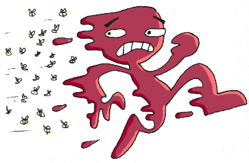
Graphic Sin #3: JavaScript that Makes a Load of Circles Follow Your Mouse Pointer Wherever You Put it on Your Browser Page
If you haven’t seen this in action, then thank the Internet Lord. If your Web site needs to amuse your visitors by having some spangly stars chasing mouse pointers, then maybe you should look at putting more interesting content on the actual page. And if I want small things following me around wherever I go, I’ll cover myself in jam and poke a wasp’s nest with a big stick.
 |
If you really want this effect on your Web site, then visit javascripts.com.
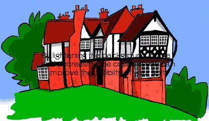
Graphic Sin #4: Background Images that Make the Text Impossible to Read
 |
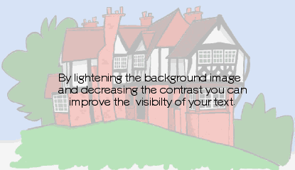
Okay, so you may be able to read the text in the image above, but it wasn’t enjoyable, was it? For readability, black on white and other high-contrast combinations work better. It’s not hard, just make sure that your text contrasts with the background. If you want to use a photo for a background, open it up in your favorite image editor, reduce the contrast, and lighten the image. This will help make the text readable.
 |
|
Before |
 |
|
After |
Graphic Sin #5: Flash Intros that You Can’t Skip
A Flash intro can be an exciting way to start a site. However, if you have to endure an elaborate 10-minute intro before you can actually get into the site every time you go there (without the option to skip), it could be a pain in the neck. How often would you go to Yahoo! or Google if, before you could start your search, you had to watch a long movie? Probably not very often. If you’re going to have a Flash intro, please allow us to skip it.
Graphic Sin #6: Font Nightmares
Comic Sans isn’t that bad, and I don’t mind its use on homepages, but when a business Web site uses it as its main body text, I can’t take it seriously. Even when it’s a comedy-based business site.
|
|
Another font nightmare is when people use a font like Times New Roman, and forget that different platforms display fonts differently. What looks like this on a Windows PC…
|
|
…looks like this on a Mac.
|
|
For readability on a monitor screen, a sans serif font like Verdana is a good all rounder.
Graphic Sin #7: Bevels
A bevel is a fantastic effect found in many image editing programs. It gives the appearance of a raised image. Here’s an example.
 |
The trouble is that it looks like a button that does something. I bet some of you even tried clicking on it. If it’s not a button, then please don’t bevel it. Another bevel-based sin, is not knowing when to stop.
 |
This just looks stupid.
• • •
Next month I’ll be looking at another seven deadly Internet graphic sins. Send all of your suggestions to gosborne@atpm.com.
|
|
We’ll be starting with that mailbox. See you next month.
![]() Copyright © 2000 Grant Osborne,
gosborne@atpm.com.
Copyright © 2000 Grant Osborne,
gosborne@atpm.com.
Also in This Series
- PNG · December 2000
- Seven New Deadly Internet Graphic Sins · November 2000
- Seven Deadly Internet Graphic Sins…or Things That Look Really Bad on Web Pages · October 2000
- The Animated GIF · September 2000
- The GIF File Format · August 2000
- Banner Advertisements · July 2000
- JPEGs and JPEG Compression · June 2000
- Help, I Can’t Draw! · May 2000
- Copyright · April 2000
- Complete Archive
Reader Comments (8)
Add A Comment