Photoshop for the Curious
Color Calibration Capers
Previously on Photoshop for the Curious
If you’re just joining us for this series, we’ve completed a three-part overview to become familiar with Photoshop’s tools, palettes, and menus. Last month, I shared a quick and easy procedure for creating more dramatic grayscale images. There was a very good reason for offering that tip before any others that are to come. That tip doesn’t hinge on your monitor being adjusted for improved color accuracy. That’s what we’ll cover this month.
Home Run, or Grand Slam?
To be fair, the steps for improving the color accuracy of your monitor are mostly done outside of the Photoshop application. But because being at least in the ballpark of correct color is so important to your work in Photoshop, it’s logical to devote some time to performing a basic color calibration.
I can’t stress enough that the following procedure is not intended to make your monitor perfectly match real life colors. Even if you used a professional tool such as the Eye-One to obtain a grand slam of color accuracy, monitors can only be made very close to accurate color—never 100% accurate. It’s just not possible.
Suffice to say that the calibration procedure we’ll be doing here isn’t even as accurate as using an on-screen sensor, but should still be something of a home run and get you close enough so that if you get back a photo from your digital camera that has an unpleasant color cast and you perform steps to fix the color, taking the fixed photo to a lab to get a print made should produce a respectable photo. This, of course, assumes the lab you use keeps its equipment reasonably calibrated.
Here Comes the Science
This next section is an explanation of why printed paper can’t represent as many colors as you see in real life. If you wish, you can safely skip down to the next subhead if you’re the type of person who only wants the “how” and has little use for the “why.”
The “why” question is: why is it not possible for a monitor to exactly match real color. More importantly, why is it even harder to match color in prints and, especially, commercial offset printing?
A lengthy sidebar article could ensue to answer this question, so I’ll leave you to some creative Wikipedia searching if you want to know more. Instead, take a look at this visual representation of color reproduction.
Suppose the large, multi-color triangular area represents all colors the human eye can see. Within those colors, there is a subset of colors, represented by the solid-line triangle, that your computer monitor can display. You’ll notice that the points of this triangle reach furthest into the red, green, and blue colors. Computer monitors blend varying shades (from dark to light) of these three colors to simulate all other colors. Thus, a monitor can display red, green, and blue colors closer to real life than any other color.
When we start dealing with photos printed on paper, however, things get trickier. In the same color space figure, you’ll see a dashed line labeled CMYK. This area represents the colors that can generally be reproduced on paper. The letters stand for Cyan, Magenta, Yellow, and Key. These are the four colors of ink traditionally used in offset printing.
“Key,” you ask? Well, many people just figure the K from the last letter of Black was used to avoid CMYB and people thinking it was Blue—and that is partially true. But the Black plate is also known as the Key plate since most of an image’s detail is generally represented there.
Back to the color space figure, you’ll note there are a few shades that can be printed which are outside the range of a computer monitor, but most of the more vibrant shades in the red, green, and blue areas fall well outside of the CMYK color space. Consequently, photo labs and especially commercial presses can’t print all the colors your monitor can display, and neither can get anywhere close to reproducing all the colors the human eye is capable of seeing.
This is why calibration is so important. The few colors which can be represented on paper should be as close as possible to what they are supposed to be.
If you’re having a bit of cognitive dissonance over the fact that a print from a photo lab can represent more colors than something printed on a commercial press, you’re right. Photo finishing equipment uses technology that can represent many more colors than a press. But the cost of doing so is significantly higher, as is the time required. It’s a cost-effective technology for just a few photos to put in your album, but a commercial press is designed to print thousands…nay, millions of impressions at high speed. Even a much smaller job would require an insanely higher amount of money and an equally insane number of days to accomplish.
Whither Windows?
Getting back to the calibration, I must say that I’m sorry (well, maybe I am, maybe I’m not) that this procedure is likely to only apply to Macintosh users. We’ll be looking at color controls that are part of Mac OS X and I frankly have no idea of the Windows equivalent. At one time, Adobe shipped a utility called Adobe Gamma with the Windows version of Photoshop which essentially accomplished what I’m about to describe here. Whether Adobe Gamma is still bundled with Photoshop for Windows, I cannot say.
Dude, You’re Getting Profiled
So here we go. Open your System Preferences from the Apple menu and select the Displays preference pane. If you have multiple monitors, you’ll see a preference pane appear on each monitor. The preferences for the primary monitor will have a tab named Arrangement, and all of them will have Display and Color. It’s the Color tab we’re interested in, and you’ll want to do these steps for every monitor you want to calibrate.
In the Color tab, you should see a list of predefined profiles from which you could choose. Most (or all) of them will disappear if the “…this display only” checkbox is enabled. All these profiles contain instructions on how to represent various hues on your screen, based on the final intent and the type of display being used.
Start With a Clean Work Area
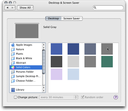
For our needs, we can ignore all those predefined profiles. We’re going to create a custom profile specifically tailored for your monitor. To prepare for this, you’ll want to do two things. First, you’ll want to clear your screen of any erroneous windows and colors that could fool your eye. Close all windows on the display except for the System Preferences window. I might even suggest that you temporarily put all icons that are on your desktop inside a temporary folder—especially if any of the icons are designed with bold color patterns. Next, switch over to the Desktop & Screen Saver preferences. In the Desktop tab, select Solid Colors, then pick the medium solid gray color.
The solid color options Apple provides for background images aren’t just for satisfying people who are boring!
Not too bright, not too dark. Neutral. You want your eye to focus on the calibration tools we’ll be using in a moment—not some distracting background such as EarthDesk, which I like to run on my desktop. In fact, you should be using this neutral gray background when adjusting an image in Photoshop, as well. Fortunately, however, you don’t have to change your wallpaper image to accomplish this. In Photoshop, simply hit the middle Screen Mode icon (toward the bottom of the tool palette) and you’ll get a temporary blank gray background for the active image.
Lay Off the Brightness
Back over at the Displays preferences, under the Display tab, you’ll need to make a decision about the Brightness control. If you have a MacBook or MacBook Pro—and especially if you have an older PowerBook—you likely need to set the Brightness as high as it can go. Remember that LCD displays become gradually dimmer over time, and I’m not aware of any laptop LCD display that’s as bright as a desktop LCD. For comparison, the brand-new 23″ Apple Cinema Display I have at my office was initially so bright, I almost felt like I needed sunglasses to look at it. Since I work on photos for commercial offset printing, I have my monitor professionally calibrated with an Eye-One device. The first thing we did before running the final calibration was slide the Brightness control down. It ended up being less than a third of full intensity! A new machine typically defaults to about a 60% setting. For most people, this is OK, but you can lower it a bit more if you’re squinting when looking at your monitor.
Time to Calibrate
Now, we’re ready to create a profile. In the Color tab, click the Calibrate button and Apple’s Display Calibrator Assistant will launch. You’ll probably notice your screen’s color and/or brightness shift a little bit. Don’t be scared. The Display Calibrator Assistant is simply resetting to defaults in preparation for the calibration. Something else to not be scared of—see that Expert Mode checkbox? Turn it on. Don’t worry, I’m not going anywhere. Let’s be experts together, shall we?
On the next page, depending on what monitor you have, you may see a Display Adjustment screen with advice on setting the brightness and contrast of your monitor. You can use this to help set the proper brightness if you’re not satisfied with the adjustment we covered earlier. Just use your monitor’s brightness controls and adjust them as described in the Display Adjustment screen.
When you click Continue, you’ll find three boxes. The middle contains an Apple logo surrounded by narrow horizontal bars that seem almost to blend into gray. This is what you’re using to examine the calibration of your monitor.
It is very important from this point on that you sit at a distance you plan to be sitting most every time you use your computer, as well as have the angle of your display tilted to what you’ll most often use. Also important is the ambient lighting in your room. The amount of light around you that you see with your peripheral vision affects how you see the object you’re staring straight at. This is why we changed the background image to a neutral gray. Obviously I can’t tell you to paint your walls and desk gray, but I can tell you to adjust your room lighting to a comfortable level that you plan on using most often. It’s OK (and preferred) if it’s bright enough for reading a book from the same seat where you use your computer.
Slide to Perfection
The additional two boxes on either side of the Apple logo are the adjustment controls. That “Expert” box we checked earlier just means that we’re going to have a few more of these adjustment sliders with which to contend. That’s all.
For each calibration step, you’ll start with the box on the left to reach a reasonably close adjustment, then switch to the box on the right to fine-tune your setting. While adjusting the sliders, you’ll be staring at the Apple logo and moving the sliders until the logo appears to blend into the background, becoming nearly invisible. Note that the left slider only goes up and down. The right slider moves up, down, left and right. You’ll also note that the right slider affects not only lighter and darker shades, but also color hues. Be sure to start with both slider knobs in the middle. Don’t be worried if you have to move them a considerable distance away from the middle to find the correct adjustment—especially on older monitors.
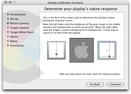
Obviously, my settings are not going to look calibrated on your monitor, but you can see that, on my older G4 PowerBook, I have to start with settings that are significantly off from the default center position.
Rinse and Repeat
You’ll do these steps and click the Continue button several times, each adjusting different tones that monitors are capable of displaying.
Alpha, Beta, Gamma
Once you’ve finished, you’ll see a screen asking you to select a target gamma of the monitor you’re using. In this screen, you’ll probably find it already set for the Mac Standard of 1.8. Macs have long used 1.8 as the target gamma because the native gamma of Apple’s older monitors was 1.8. Virtually all monitors these days have a native gamma between 2.0 and 2.2. Yes, a setting of 2.2 is going to seem a bit dark and/or high contrast if you’ve used Macs for years. Buck up as best you can and go with the 2.2. Try 2.0 if you just absolutely cannot stand 2.2. Also, leave the native gamma checkbox off.
White or Off-white?
Finally, you’ll select a target white point. This step is akin to setting the white balance on a video camera. Unless you know of a good reason to do otherwise (and I doubt you do), just enable the checkbox to use native white point which should set it for approximately 6500 degrees.
After a few years, any monitor will start to discolor a little bit. Lowering the white point setting a little can compensate. The native white point checkbox must be off in order to adjust the slider.
The thing that surprises many people is that a well-calibrated monitor actually appears to have a slight reddish tinge to it. You’ll find that reducing the target white point will add the reddish tinge back in. Before I started having my office computer calibrated, I noticed that a photo which looked great on my screen would come out with a red cast at a commercial offset printer. I suppose it’s just the nature of the beast that is commercial printing. The red tinge of a calibrated monitor offsets the red cast that appears on press. I’ve been told that a similar situation exists for most photo finishing labs.
Having said that, don’t just go arbitrarily reducing the white point setting unless you can measure your monitor’s white point. If you have no means to measure, you might try opening a digital photo that you know produced good color in a print at a lab. If you look at it now and it seems to have more of a blueish tinge, you could try lowering the white point setting until the photo seems more like what you’d expect. Just don’t go overboard. Your eyes can deceive you. If you do make an adjustment here, it shouldn’t be more than 100–200 degrees. If you’re just not sure, leave the white point at 6500.
Finishing and Saving the New Color Profile
Once these settings are done, you’ll see an option to allow other users who might log into your Mac to use your calibration setting. That’s up to you. Once you’ve chosen, you’ll then save your profile. It will probably start out as the name of your display with the word “Calibrated” on the end. This is fine. Unless you want to get creative, you can accept the default name and click Done. Then you’ll see a scary-looking screen with a bunch of numerical calibration settings. Take a deep breath, click the Done button again, and it’ll go away.
That’s it! Now be honest, that didn’t hurt so bad, did it? You’re even already getting used to that 2.2 gamma, aren’t you? If you have a second monitor that you want to calibrate, go ahead and repeat these steps using the Calibrate button you’ll find under the Color tab in the Displays preference window associated with that monitor. Best of all, these steps are not permanent. If you feel you completely loused up the settings, just go back and click the profile that was selected before you did the calibration, and you’ll be back to where you were. You can then start over and try the calibration again.
Mature Monitors
I think this is the third time I’ve mentioned this fact, and it can never be said too much—monitors don’t retain their color accuracy forever. If you’re truly anal about wanting to stay reasonably accurate with color, but don’t want to make the jump to using an Eye-One sensor, you should go through the above calibration steps perhaps once a month or every other month. Otherwise, once or twice a year is probably fine. Just don’t set it and forget it.
Next Month…
Yes, yes, I know, I did it again. I’ve learned my lesson. I will stop trying to be so ambitious about the topics I plan to cover in the following month’s column. I said in February that we’d look at the Levels control. Well, what happened is that I decided I want to include a small bit on the Curves control as well as Levels (yes, they’re very much related). Doing both of those, combined with the length of this tutorial on basic calibration, was simply turning into an enormous article.
So I’m putting on the brakes here to give you your next homework assignment and to resolve to be more careful about what I promise for next month. Therefore, next month will cover the Levels and Curves controls. If anything else is also covered, that’ll just be a nice bonus, right?
Here’s your homework assignment. Now that your monitors probably look a whole lot different than they did before you started reading this column, open some original/unaltered digital photos and study them on your newly calibrated monitor. You could even open the Color tab of the Displays preference pane and flip back and forth between the default profile (the one without the “Calibrated” word at the end) and your new profile. You should observe that the colors are truer and contrast is better. Note that I didn’t say the colors will be more vibrant—only that they should be truer, or more natural. The fact is, more natural-looking color does not typically equal more vibrant-looking color.
With the calibration finished, if you feel your photos don’t have that same vibrancy they did before, remember that we didn’t change your photos at all—only how your monitor displays them. You’re now seeing them more in line of the way they really are, and the way you’re more likely to see them if you take them to a lab to have prints made. If you think they need more snap, we’ll soon learn how to get into the Saturation controls in Photoshop and give the color a little boost.
![]() Copyright © 2007 Lee Bennett, lbennett@atpm.com.
Copyright © 2007 Lee Bennett, lbennett@atpm.com.
Also in This Series
- File Format Fever · November 2008
- Don’t Reset—Preset! · October 2008
- Don’t Yield—Merge! · September 2008
- What If I Just Left It Alone? · August 2008
- Screen Replacements—When Reality Isn’t Real Enough · July 2008
- No Smoking Gun: Re-tooling Dodge and Burn · May 2008
- Mask-erades · February 2008
- Back in February · November 2007
- I Love Layers · October 2007
- Complete Archive
Reader Comments (12)
My second monitor is a refurbished (cheap) Mitsubishi Diamondtron. It always seemed to have a lemon-tint to it, but it never occured to me that I could fix that. Well today, on that screen, my photos look awesome.
You can rest easy about your second monitor. Even at work where I have my primary monitor calibrated by a pro service bureau, I only do quickie calibrations on my second monitor because all I ever put over there are my palettes and both my e-mail and instant messenger windows. Color is of no matter to me on that monitor. But I'm glad you managed to get yours looking better!
When using the Clone Stamp Tool the target X disappears into the photo. How can I make it more obvious and easy to read?
Regarding the Clone Stamp target, check your Photoshop preferences. There is a pane with options of what type of icon to use for the Clone brush. Maybe one of those will be more to your liking.
From your article it seems that the red tinge is "good" and that edits in Photoshop to reduce the tinge will actually make the image look better when printed. Did I get that right or do I have a problem with my monitor/color settings/Photoshop?
As I said, with the profile I use, images do have a little bit of a red cast to them. But this is representative of the reddishness I would see in unadjusted images if I sent them to the press as-is. Therefore, after I do my preliminary editing on a photo and then convert to CMYK (I never do significant color work on a photo bound for offset printing until I'm ready to convert it to CMYK), I will then use the Color Adjustment tools in Photoshop to fix the "red tinge" and make it look good. Because I know my calibration is spot on, I know that by removing a little red (adding cyan) or whatever other adjustment, what I see (that is to say, what I fix) on my screen is how the photo will come out on the press.
Add A Comment