About This Particular Outliner
Mindmapping Outliners
When I began this outliner column, I resolved to stay well within the domain of “ordinary” outliners. That domain is confusing enough; it is populated by several dozen applications (listed last month), most of which might be a perfect fit for someone’s particular needs. And as we’ve noted, those needs, use patterns, and interface strategies are all over the map, depending on how you live your creative life.
So as a matter of sheer scope, I didn’t want to open the even vaster spectrum of “mindmapping” outliners. But I’ve gotten lots of requests to do an overview of them.This column, dear readers, is proof that we boldly go where you wish. As a result of your navigation of this ship, this month we examine outliners that also present what is commonly called a “mindmapping” or charting view.
Inspiration
The kind of outliners we’ve been covering so far are essentially editors—at root, text editors—that add graphic layout. That graphic layout is a matter of indentation, disclosure triangles, and often styles and interface icons. The whole thing refers to a linear flow: no matter what information you are capturing, the outline has a beginning and an end, a flow.
That makes outlines a natural for authoring something that will end up being read linearly, like this column or a book. The linear nature of outliners is also great for setting up and navigating ordered lists, including to-do lists which might be ordered by date or priority. Lists that depend on an indexing order, like the alphabet, also do well with outlining.
That makes sense if I am writing Lord of the Rings. But what if I also wanted an outline of all the features of the fictional land: place names, rules history, geographic features, and such? There’s no natural linear order for something like this: in fact, it might even make sense to lay it out rather like a two-dimensional map.
That’s where these chart views come into play. Where outliners are graphic features added to text layout to manage concepts, mindmappers are the opposite: text features added to graphic layout. For many users, switching between the two is a pretty powerful combination.
Techniques for visual brainstorming have a long and complex history, largely independent of outlining. A few sources claim an origin in Leonardo DaVinci! As it happens, I’ve been personally involved in some of the more recent history of visual brainstorming, moreso than in the outlining branch that is the focus of ATPO. But that history is so twisted, diffuse, and controversial I couldn’t possibly give a meaningful summary. It wouldn’t illuminate much anyway.
A relevant touchstone is the work of British psychologist Tony Buzan who in the 60s coined the term “Mindmapping” for his approach to the then new technology of whiteboards and erasable markers. Those concepts were:
- Start in the center of the board with a “root” and branch out in spreads of 5-8.
- Use graphics and color as much as possible; when using text, use simple, single words in bold lowercase because it registers in the mind more clearly.
Radical claims were made for the power of this technique at the time. Most of these are indefensible in retrospect.
Since then, the Buzan organization has trademarked the term. Some of the applications surveyed below have official Buzan licenses, but I could not suss out precisely which ones or exactly what it means to have a license. Also since the 60s, “mindmapping” has found its home on the computer desktop, has merged with outlining (since both work with trees), and has evolved some new conventions not originally “invented” by Buzan.
In this column, we’ll use the term generically to apply to any graphical view of outlined material whether it is “official” or indeed whether it conforms to Buzan’s principles.
About Tools and Thinking
But before we look at applications, I want to take a relevant detour. In previous columns, I’ve made my own outrageously broad claim: that the tools you use profoundly affect the way you think and work. Several of you have messaged me to disagree, claiming that a tool is simply good or bad. In this view, a tool can get in the way but given the same mind, what would be produced would be pretty much the same no matter the tool.
But at least so far as groups of minds, this isn’t so. For instance, people who study humor have been able to track how the notion of a joke changed at certain key points in history. One significant cusp was when the Hearst newspaper chain found it competitively convenient to package comics as the “strip,” with three or four panels. In short order, many jokes changed from the longer form of spoken stories to a more abstract setup in two or three steps, then the punch.
(For a great example, snap down to ATPM’s own Cortland strip.)
This form of humor was completely shaped by the visualization technology but quickly spread to be a dominant form in other media as well, even reinventing the spoken joke and extending to many of those internal jokes we have with ourselves.
Or consider this. My visualization training included an extended dip in the world of architecture. Back in those days buildings were actually designed on paper! And guess what? The size of the paper (together with the scale of the drawing) determined the size of the architectural feature and effect. Big deal, you might say. But repeated exposure to the same scales of architectural features permanently changed how we interact with buildings and the fabric of cities. What you now experience and appreciate in New York or Budapest or Paris has a lot to do with the presentation technology behind its creation.
Friends have been bored by my tours of American cities where I point out architectural features whose scale works amazingly well, but which were shaped by the limits of the technology. As an example, most folks are familiar with the late World Trade Center.
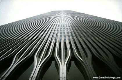
World Trade Center, for more visit this page.
See that detail where the columns fork into three sections? Why that height and not another? Yup, size of the paper. Same with the size of the plaza and the atrium and many, many features of the former World Trade complex. Even though computers have now freed us from paper, designers still use those dimensions because that’s what we have come to expect in what works. So the replacement building will employ many of the same scales. It’s the architectural equivalent of making software bug-compatible with what went before.
It is also something like the Star Wars effect. Now, every space battle in movies has to have a certain type of noise and fireball effect to seem real. And the ships must move in arcs determined by aerodynamics and gravity. The “real” real would seem false.
Or consider this very strange way that technology has shaped your mind. Romans developed the serif for monumental inscriptions.

Detail of Trajan’s Inscription, more here.>
The serif is the “foot” at the bottom and top of the “N” for example. The serif exists purely because of the technology of stone and chisel. But when the Romans minted coins, they made the letters look the same—more “official,” you see—even though the technology didn’t demand it. Later, monks emulated the chisel effect with brushes, leading to our modern font designs. Nearly all books and periodicals are set in serif fonts because that’s what now works best. It’s the Star Wars deal at the lowest cognitive level.
Why would I bring this up? Because countless studies indicate that even though mankind has been exposed to the printed page for mere centuries, that remnant of the display technology has somehow become hardwired in the way we receive ideas from words. Not only that, but most of the information is inexplicably contained in the top half of the letters. See for yourself below. Try the same thing with the bottom half of any text.
Tops of Letters
We do imaginative, creative work within many conventions dictated by visualization technologies. Why should the Mac tools in which you actually live be any different? One size does not fit all, which is why ATPO readers don’t live in the Windows world. Instead, Mac outline users work to discover their own particular outliner, which supports and leads the imagination. Helping in this discovery is how I justify the effort of ATPO.
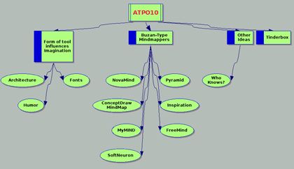
Six and a Half Buzan-type Mindmappers
We now return you to your regularly scheduled column. Ordinary, Buzan-like mindmappers are: ConceptDraw Mindmap, $150; FreeMind, free; Inspiration, $70; MyMIND, donationware; NovaMind, $60; Pyramid, $30; and SoftNeuron, $15.
SoftNeuron
The simplest of these is probably SoftNeuron, which we were unable to review. It appears to be a cross-platform Java application from Hungary. There is no demo, and the developers do not return queries. There is one image on their site which you might want to check out for completeness, but this looks like a loser. We only mention it for completeness.
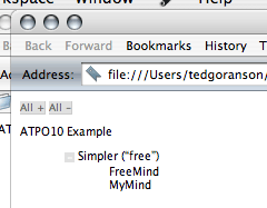
FreeMind
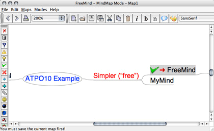
FreeMind is also a cross-platform Java mindmapper, this one from the Czech Republic. But it is a bona fide open-source project with apparently robust development. Because it is a “run-anywhere” Java application, you don’t have the nice Aqua interface. Compared to some of the others, this is decidedly unflashy: the Mac-style controls don’t work well; you are stuck with the default layout, and the support for graphics is almost completely absent. (That menu along the left edge is of “labels” you can apply—we’ve applied a green check to the FreeMind child.)
There are no clones, notes (!), or any of the advanced things we’ve come to expect in outliners. But URLs are supported as shown in the shot.
FreeMind
The big deficiency is that there is no editable outliner view; you work in mindmapper mode and that’s that. On the other hand, some things are implemented so elegantly that this little thing is just begging for space on your hard disk. You add a new child by simply pressing Return. Basically everything you need to ordinarily do (promote/demote and move entries) is done by non-reassignable but very handy keystrokes. Drag and drop reorganization is quite elegant, as is the implementation of collapsing.
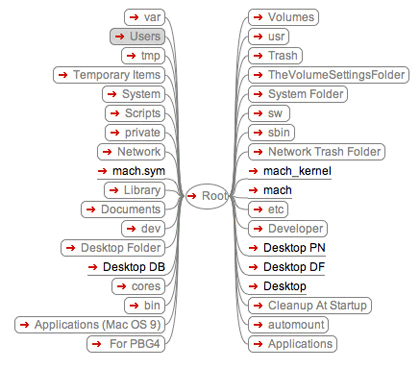
Links to files and URLs are supported. Here’s the killer trick: choose “File” mode (option 3) and instantly get a navigable mindmap of your hard drive! Imagine my shock when writing this column to find that hot navigation is broken in the current release. Oh no, saving is broken! Well, if you send nice mail to the developer, he’ll fix it again and you’ll have a mindmapping counterpart to your Finder Outline.
FreeMind’s Finder Navigator
I hate to be extolling something that is broken, but here is one more feature that is attractive. Though it has no outline editing mode, it does have an “export to Web outline” mode that’s nice, as we mentioned in last month’s ATPO. The collapse and expand controls can be tailored to some extent.
FreeMind’s Weboutline Export
MyMIND
We are walking roughly from least capable to most. Next up is from Germany. I have it after the other two because it works, it has a native outliner, and it is a Mac Cocoa application. It is also the only outliner other than OmniOutliner that supports user-defined columns.
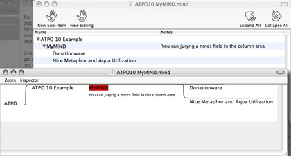
MyMIND
It uses a unique and friendly hand metaphor in its controls and icons, which lends itself well to gestures if you choose to use them. MyMIND has two features that you will not find in other mindmappers. The first is the columns. Columns could be an extremely useful tool in mindmapping, and MyMIND presents one example why.
You can create a column and enter some “values” as shown, Test1 and Test2 for example. Then you can execute the command: “Connect Nodes With Same Attribute…”
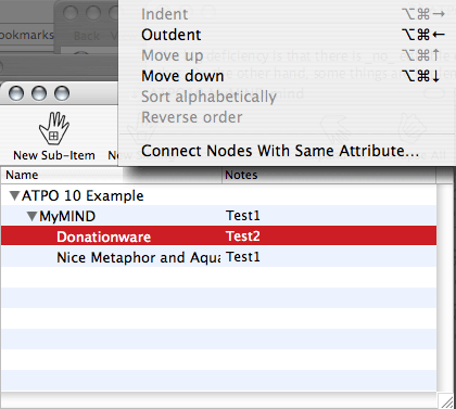
MyMIND Column Values
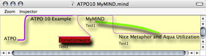
And you get a map that creates something like a link. Cool possibilities should be jumping about in your mind. This screenshot also shows some display options from the inspector, which leverages Aqua and Quartz. Also, the “Donationware” node has been dragged to a new location.
MyMIND Column-driven “Connection”
MyMIND exploits columns for its other unique trick. If you label a column “URL,” you can generate maps that can be used as HTML image maps, where zones are links. MyMIND exports as OPML, which makes it a good citizen in an outlining suite.
The key problem with MyMIND is that the map mode is a report-view only. All editing must be done in the outline, which sort of blows the advantages of mindmapping: to brainstorm in either mode. However, I will make a special appeal here to send encouragement to the developer, Sebastian Krauss. These guys are the backbone of Mac development.
Pyramid
Now we turn to commercial products. Next is the new Pyramid from MindCAD. Pyramid and NovaMind are the only two native commercial mindmappers for OS X. In fact, Pyramid absolutely requires Panther. Pyramid is the less expensive and by far the less capable.
ATPO readers may note that it is not on the list of outliners to track; that’s because it has no built-in outliner! Pyramid is a graphical mindmapper only. Alas, it cannot integrate with any other product. It neither reads nor produces OPML or any other format that can be readily exchanged with other outliner products—a strange design decision.
What Pyramid does is somewhere between charting and mindmapping. You can create tree diagrams, more than one per “worksheet.” Your documents can consist of several worksheet pages, selectable by tabs. The worksheet behaves like a neutered TextEdit page: you can drag text and images but not files or URLs.
You can link headers you create in tree structures that grow in the four directions away from the root-like dominos. One worksheet can have several roots. Each header can have a note attached that displays in a pane below.
Pyramid
I found the assembly of boxes to be very tricky, and in some cases impossible. What you see in the screenshot is the only option for layout, excepting some “tightening” controls. You cannot, for instance, move a box around.
NovaMind
NovaMind is something of a gem in this collection. Coming from Brisbane, Australia, it has a text outliner that supports the rudimentary outlining tasks such as indenting, collapsing, and grouping. Cloning and linking are not supported. However, NovaMind is a good player with other tools, importing and exporting OPML. (Swapping outlines among tools loses any custom layout in NovaMind.)
It is in the mindmapping that the application focuses; I get the impression that the creators expected the tool to be used as an early brainstorming tool with the results moved to another tool for the next phase of maturity. Exporting to Keynote and PowerPoint is supported, as well as the seven OPML outliners listed last month, but it is nice to have a real built-in outliner for the dual modes of thinking.
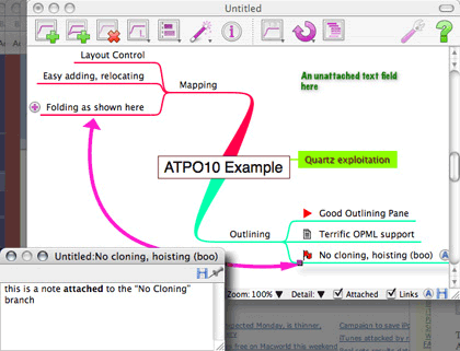
When doing this sort of mindmapping, what you’ll want are many of the same things you want in text outlining: to easily add and annotate new topics, and to move topics around logically and graphically. You’ll also want some advanced outliner features like links, clones, folding, and hoisting. And then you’ll want the stuff that comes from mindmapping: extreme and easy control over the layout and appearance of the map.
NovaMind doesn’t do all that well on the links, clones, and hoisting. In fairness, no Buzan-type mindmapper does. It only supports a graphical but interbranch link with no logic, and no clones or hoisting. But it does an excellent job in supporting map element creation and display. It supports map folding like FreeMind, but it usefully gives a little “plus” to indicate when folding has happened. Single branches can be collapsed and expanded. As well, the whole map can have lower levels folded.
Here is a screenshot that shows an example.
NovaMind
There is one folded branch. Also note the symbols in the lower right. These are what NovaMind calls adornments. They appear before the labels in map view only and carry no significance other than visually. You can edit and import them. The shot also shows a note and a link. Each branch can have a note, but it is not editable in outline mode. URLs and file hyperlinks are supported to external objects.
That pink line is an interbranch link. It is not nameable. Links are easily added and temporarily suppressed, but as with adornments, don’t “stick” to the logical structure in any way.
I am very impressed with NovaMind’s layout support. I suppose I should be, as that is the whole point of the application. There are various types of “snap” tools that allow the application to handle details of how things are arranged and colored. These are a great aid in brainstorming as one does not want to stop thinking and worry about formatting.
Perhaps we’ll review NovaMind in detail in a future ATPO as it is the leading Cocoa mindmapper, and there are several cool graphics features and some productivity issues that we are leaving out. Cocoa brings a lot to the table yet to be exploited, and Tiger promises some greater possibilities. There are lots of things missing in our account, which will give the vendor fits, like curved text that follows curved branch lines. A key feature is the ability to import graphics and assign them to branches. We won’t illustrate this because others do it with less hassle at this point, but it can be done by finding and importing images one at a time. You’ll see the results of this idea below.
Another notable omission in our account is the built-in support for screenwriting. Apparently, successful commercial mindmappers need to have an anchor user community. ConceptDraw targets planners, Inspiration education. Several such Windows products target law firms. NovaMind seems to be putting significant energy into this. It is in fact something I can evaluate, but is not likely of interest to ATPO readers. Net result on the screenwriting support: quite promising but not ready for real work yet.
ConceptDraw Mindmap
This Ukrainian product is part of a roughly integrated multi-platform (Mac and Windows) suite of planning and scheduling software: ConceptDraw (which competes with Visio and OmniGraffle), Project (Microsoft Project and Schedule), and Presenter (Keynote and PowerPoint). They also have a special collection for the medical market, presumably their target anchor customer. The Mac version is a Carbon application.
Now allow me to step back from the column a moment. As you know, ATPM is serious about its journalistic standards. This column is not a review column, but we come pretty close when we do a survey like this. All products should be given the same level of attention, indeed respect. But we are hampered a bit in being fair with Odessa, the developers of ConceptDraw Mindmap. About a dozen requests over last year the about their product have gone unanswered.
They have a one-month demo. But when that expires, no subsequent demo on any user account can operate. Couple this with my natural aversion to obvious and inelegant Windows ports, and you should take this section with copious salt. Warning complete.
I’ll say this, the developers seem to be aggressive in chasing the business enterprise. And they are being very smart about building a suite of applications, something all the big boys are doing. Their mindmap application is the last of their offerings to appear, and it is clearly targeted at supporting their project planning-oriented suite.
Its outliner is optimized as a project task and resource allocation outliner. It is not well suited for general outlining and stacks up poorly with over a dozen Mac outliners. The mindmapper’s interface presents several platoons of Microsoft Word-derived toolbars. Once you get past this and some keyboard controls not optimized for Mac users, you are presented with a capable mindmapping application for $150. For instance, it has indigenous drawing tools like no other application mentioned here. The screenshot shows one of the supplied maps.
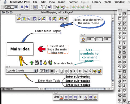
ConceptDraw Mindmap
The basic tools to reorganize and tailor map elements are clunky compared to others, though. The example shows one node with what they call “symbols” and which NovaMind terms adornments. That toolbar to the right is the adornment library. Hyperlinks to external items are supported, but internal links are not.
Overall, I’d say that except for drawing, everything that ConceptDraw does, some application in this column does better, except for the very nice support they have for “templates.” A template is a coherent collection of all the styles which you can set for a map. You can create a map in any hodgepodge fashion you like and apply the template to have it appear as you wish, though the automatic layout options aren’t as sophisticated as we’ve seen with NovaMind.
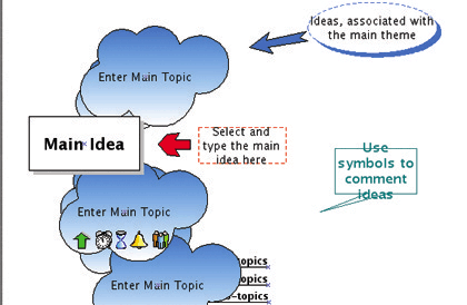
The screenshot shows the previous map with a new stock “cloud” template applied. You’ll note that the layout tools weren’t smart enough to move the subtopics out from under the clouds. But still, I can see how this would be very useful: one style for group brainstorming, another for Keynote type presentation, and perhaps a third for shrinking in the printed report.
ConceptDraw Mindmap Changed
And here is the outline view for that map. One topic has a text note and a hyperlink attached, denoted by the icons under the “T” and “H” columns respectively.
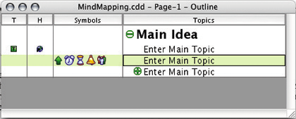
ConceptDraw Mindmap Outliner
Inspiration
Our final Buzan-type mindmapper is Inspiration. ATPM reviewed version 7 of Inspiration last year and rated it Very Nice. Go there or to the longer ATPM review of version 6 for more detail as the current version 7.5 differs little from 6.0. At least two ATPM editors swear by it.
It is a Carbon application. As I recall, it started life on the Mac and then with so many others moved to Windows. It never became a fully Windows-like program. So even though the interface—which hasn’t changed much in several years—isn’t very Mac-like, it isn’t very Windows-like either. And that’s a good thing.
Inspiration’s target market has migrated to junior high and high school mindmapping, and all their marketing is directed toward that effort. They have a “junior” version, Kidspiration, for kids ten years and under.
In the ATPO on Outliner User Interfaces we remarked on Inspiration’s features in the normal outlining mode. It is unapologetically set up as a writer’s outliner with good reorganization tools and a very nice way of handling inline text. It has clean controls and supports the very useful ability to independently set the styles of header levels—and that means a lot.
However, it compares poorly to other outliners that have cloning, internal links, metaoutlining, hoisting, and other advanced features. It also has limited style controls, in part because it doesn’t use modern Mac OS X text formatting.
Friends who use Inspiration for writing tout the export to Word. There is no OPML or other XML export, so Word (or RTF) is what you are stuck with. The export is imperfect: headers do not export as Word outline headers, for instance.
Inspiration is from Portland, Oregon. It is a mature product that will satisfy most mindmapping needs. Where it shines is in the use of images for nodes. This is the element they are leveraging for educational use, and they do a good job. A floating palette contains images from the several libraries you may have loaded. (Inspiration comes with scores of libraries, and it is easy to assemble your own.)
The use of images (which Inspiration calls symbols) is as easy as it gets. You can create your nodes in “rapid fire” mode where a new node is created by a simple Return. Or you can do it the usual way, by setting the node and direction of growth. Then simply select the node and select a symbol in the library. Easy-peasy, as the kid who was demonstrating said.
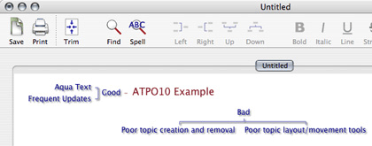
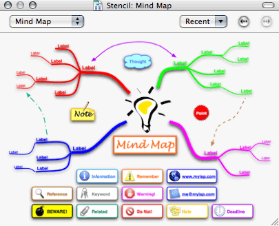
Here is a screenshot that shows a mindmap populated with animals. I’ve chosen photographic type images, though line drawings are in this library as well. The first screenshot in this column is also from Inspiration and shows another style of graphic use.
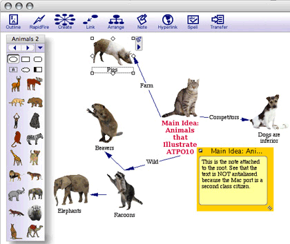
Inspiration
It doesn’t have the graphic polish that NovaMind does: shadows, rainbow selection, auto-layout options, variable link width, shadows and all. But it has some refinements that show its maturity. Two of these—both shown in the screen shot—are big deals for me. Links can be labeled, a surprisingly rare feature among mindmappers. Also, look at the symbols it uses for notes and collapsed nodes connected to the selected pig. These are precisely the same conventions used in the outlining mode, and they work the same way. Oddly, those nice level-based styles you can specify for the outline do not carry over to the map view. Ouch!
Buzan-style Bottom Line
Of this lot, MyMIND is the best bang for the buck, NovaMind is probably the best overall Mac experience (and the one that plays best with other outliners), and Inspiration has the best built-in outliner. But I recommend that you play with them all—you may fall in love with one of the others.
I mentioned the country of origin for each product because I contend that mindmappers are perhaps the Mac’s most international product category. That’s good.
As with outliners, there are a few Windows-only mindmappers, fewer in number than are listed here. My survey of them gives the same result as with outliners: there’s nothing better than what you can find on the Mac…unless you value the purported deep integration with Microsoft Office and Project through XML that MindManager advertises. And as with outliners, the terrain on Linux is bleak—a puzzlement.
Tinderbox
Buzan-type mindmapping is not the only solution to this problem. Tinderbox has another. Next month we’ll get into Tinderbox deeply, so we’ll only mention the one relevant capability here.
The Buzan approach originates in the whiteboard world and computerizes it rather like word processors computerized the typewriter (and Photoshop computerized the darkroom). The magic of VisiCalc (the first spreadsheet) was that it started with what could be done with a computer and then applied that to a specific problem.
Tinderbox starts with what computers can bring to the table, specifically in the form of “spatial” hypertext, then applies it to the same problem: graphical brainstorming and organization for presentation and use.
Mindmapping draws tree structures. There two types of objects, links and nodes, but they waste much of the power of the “link” object by limiting it to denoting only the tree relationships. “Official” mindmapping does not even allow the link arcs to be named. NovaMind sneaks in an extra node-to-node link, and Inspiration provides the ability to name nodes, but neither of those carry over into the logical structure of the thing.
Tinderbox uses the same two types of objects, links and nodes, but it doesn’t waste the link by having it display the hierarchy. Nodes are rectangles, and a child node is shown as a rectangle within a rectangle. This has a few advantages:
- Changing parent-child relationships on the map is way simpler in terms of the movements required.
- It graphically solves the problem of folding, changing it to a more graphical notion of “zooming in.”
-
The link arc is freed to denote a real link, and many types of user-defined links are possible. You can use links in an ad hoc manner or to define “concept maps” or many of the other emerging techniques for information architecture.
- Extremely large collections of nodes are more visually comprehensible because of the nesting and large numbers of nodes at the same level can be spread out on a plane larger than the viewing window.
The screenshot shows an example from the tutorial. It is extremely difficult to illustrate this in one shot. The two boxes at the top are “containers,” first-level headers. Clicking on them will zoom into those notes. They already have five characters and three locations respectively, and we are working on a new character (“Franklin’s ex-wife”) and location (“Franklin’s house”) which will be dragged in a moment.
The two grey rectangles are “adornments,” extra cues. The box marked location is a special type of note, actually a “prototype” of locations. Making a prototype link to a regular note as shown bestows location-associated properties. So in this little diagram we have three hierarchies: the container/tree one, the object oriented like one with the prototype and its instance, and the extra visual one of the adornments. No clones are shown here.
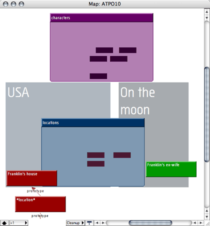
Tinderbox
Incidentally, Tinderbox also allows graphical views of the tree structure, in the form of bare-bones mindmaps, but I suspect they are rarely used. The big disadvantage of Tinderbox’s approach is that you cannot paste a graphic on a note’s node to give some additional meaning to it—you are mostly stuck with the title in a rectangle. Links are named but if you work with documents as complicated as mine, the links quickly become overwhelming and chaotic. The solutions around these potential problems are:
- A very high degree of graphic control over the color of the box, together with an unlimited number of other (mostly non-graphically apparent) attributes. Amazingly, the eye can discern a high number of hues and associate objects of the same hue more readily than pictures. Pictures require more cognitive work.
- Automatic agents that can collect notes in special views according to those attributes.
- “Adornments” which in Tinderbox-speak are graphics on the map that are not part of the outline. Adornments are often rectangular containers that have an associated graphic or graphic background.
- A much more sophisticated outliner and outline view than any mindmapper, indeed in many respects than any outliner.
- Extra facilities to examine notes in context. You can “open” a note of course to view and edit it, and you can “get info” on a note to see its attributes. But the extra tools of interest here are those that allow you to view paths, “roadmap” (its relationship to other paths in context), and hypertext status.
- And clones. Once you use clones in an ordinary outliner you will never, ever go back. That’s because as powerful as hierarchies are, they are often a poor organizational structure. I might want my dog in the Animals hierarchy as well as in Pets and Friends. Clones (which both Tinderbox and the Finder’s outliner call “aliases”) are the solution. A clone is like a superlink that says “this note has another face over here.” Clones are better leveraged by the Tinderbox containment paradigm than that of the mindmapping tree.
More about Tinderbox next month.
Other Approaches
As long as we are at it, let’s mention some other approaches to “maps.” You can have a whiteboard that contains a graphical outline. This is the Buzan approach, though ConceptDraw and Pyramid extend it a bit by allowing multiple whiteboards per document. But you can also have outlines of whiteboards and outlines of whiteboards that contain outlines. Curio does the first. Keynote does the second.
In other words, Buzan-type mindmaps are “pictures” of outlines. You can also have outlines of “pictures.”
We’ve mentioned Curio in earlier columns. Basically, it is an outliner where every note is an unstructured map and the outliner headers are images of the note pages. It moves the tree from the page to be a tree of pages. But the content on those pages can be richer than in mindmappers, and it can contain Web-generated material and multimedia.
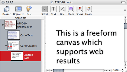
Curio
Keynote is similar in this. If you discount the presentation mode and just focus on the editor, it is like Curio in being an outliner of pages. Keynote pages can contain information far less varied and sophisticated than Curio’s with one exception: Keynote pages can contain outlines that are somewhat integrated with the higher level outline, an outline of outlines feature that I value.
We need to include OmniGraffle as well. OmniGraffle does not have an outliner, though integration with sibling product OmniOutliner has been indicated for the future. OmniGraffle is a charting program, a very impressive one, that can draw mindmaps. An OmniGraffle mindmap “stencil” exists.
These drawings can be every bit as pretty as NovaMind’s and in fact are much smarter in the construction sense. But they consist of pictures only, rather than a structured collection of concepts. This may be good enough for you if your mindmap is not intended to feed a workflow. OmniGraffle images can easily be used in Keynote and Curio, in addition to its own paged presentation format.
OmniGraffle Mind Map Stencil
Promising Ideas
Gosh, the area of structural visual brainstorming and editing is growing fast with many new ideas flowing in. Let’s take a moment to look at a few of these. I’m involved in the first three personally, and I think they will make a difference in a next generation of Mac “outliner” products.
Symmetry Grids
Last month we reviewed SymmetryWorks, a great tool for creating symmetrical tilings. I also mentioned that I am an officer in the international symmetry society. What’s that all about? The idea is that the mind sees structure via several mechanisms. One of these is association, for instance of elements of the same color. Another is by semiotic association. (Semiotics is the science of signs and the meaning of symbols as signs.) Buzan’s notions rely on the semiotic value of pictures imposed on map nodes to trigger this effect.
Yet another is proximity, which we address in the section below on “semantic distance.” But the most profound and deep is by pattern, and the primary cognitive mechanism of perceiving patterns involves symmetry, either through symmetric regularity or irregularity.
So you may find it useful to work with symmetric grids in your mindmaps. Try it. We have scads of experiments (unhappily classified) that attest to their utility in many cases. I’ll give an example using OmniGraffle.
Here’s the idea: when you arrange ideas in a tree, you are moving some semantics into geometry. It may not be very rich semantics, probably just “this idea is more detail of that one.” But it could be more informative, like “this animal belongs to this category.” The concept lattice business (explained in the section below) goes all the way, with the idea of making huge percentages of the semantics geometric so that the eye and computer can deal with it readily. But it is not conducive to free-form brainstorming, at least not without new tools.
This idea of symmetry-informed mindmapping is to do something in between white-boarding and full concept lattices. The example has two grids: one at the overall level and another more stringent for each node. I’ve chosen OmniGraffle for this example in part because OmniGraffle objects can have links and scripts attached, so that you can click on a node in the big picture and open another OmniGraffle page. Also, you can do some of the heavy lifting in the open-source tool GraphViz.
Symmetry-ized OmniGraffle
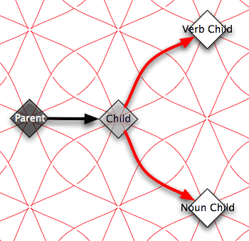
In the background is a simple symmetry grid that I created in about 90 seconds in SymmetryWorks. You’ll note that it is two grids in one. The first is a square grid. The nodes labelled “parent” and “child” are arranged according to that symmetry. You may want to do something similar for your high-level brainstorming because you can superimpose that square grid over the built-in (square) grids of NovaMind or OmniGraffle.
There’s a second grid as well, one that aligns by diagonals. This is square as well, but connected by diagonal arcs. If you choose something like this, you’ll find it handy that diagonal nodes also snap.
The diagonal links are two, swooping with opposite curves. I chose this grid as an example because I use it frequently when coming to a leaf that I want to switch to a more detailed grid than the Buzan-type north, south, east, or west link. I assign one of the arcs to a “verb” association (say the north, north-east one) and the opposing arc to the clockwise for a “noun” association. A diagonal link means I have shifted into a semantic link type and it is clear from the shape what the nature of the semantics are.
I might have, for example an old-style map semantics with parent=pets, child=puffy, and then shift into another map semantics captured by the shape, noun type link=cat, verb type link=purrs. Cool, huh?
Concept Lattices
One way of extending the notion of charting ideas and relationships is to make the structure logical. Pairing mindmapping with outlining goes some of the way in this direction. Scripts can actually do some interesting things with collections of concepts if they are in a well structured outline. This is why ATPO values scriptability and XML so much.
But you can go much, much further, and people have of course done so. Here’s an approach which uses outline-like structure and mindmapping-like intuitive graphical displays, but adds a deep formalism for knowledge representation. It is called “formal concept analysis,” and actually has a significant community of allied researchers.
A good starting Web page is here. There is some fairly mature open-source Java software, if you are adventuresome.
The group I was with tweaked the formalism to make it more intuitive and to leverage symmetry. (Most lattices are two-dimensional and often not symmetrical. We also add the importance of direction.) The graphic shows an example lattice. Here’s how it works: you start at the bottom. Moving up the lattice in one of the four directions confers the property of that “vector.”
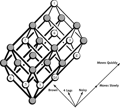
An Example Tweaked Lattice
For instance, you can see that item 8 has the property of brownness but none of the others. Item 9 has two units of “fastness” (very fast) and one shift of “four legs.” Item 7 has three properties.
The ten items on this lattice are:
- Dog
- Snake
- Bell
- Plane
- Table
- Tricycle
- Turtle
- Mud
- Rabbit
- Wind
This is an extremely powerful visualization technique if you work around the weaknesses, which all concern scaling and complexity limits. We managed lattices of huge numbers of dimensions with 3D reduced “zooming views” that took out all but a few dimensions. We employed hyperstereograms (go here for an example) to envision higher dimensions. And we fiddled with symmetries a lot.
Everything in a lattice can be reduced to an outline. What’s cool about this is how similar items cluster in easily discerned patterns, and things that differ or are related in complex ways also cluster. It’s pretty powerful for some uses.
Semantic Distance
But perhaps the most significant mapping advance is the notion of “semantic distance.” This is brand new and probably unrelated to the stuff above.
(Semantics is the study of meaning, so the semantics of an entry in an outline is what it actually means independent of the various methods used to express that meaning.)
The need came from things like the Semantic Web. The idea here is that if everyone signed up to one religion, communication would be perfect and the world would be happy. Unfortunately, I blew vast wads of taxpayer money proving that this is not an achievable or desirable state. People prefer to live in their own worlds for good reasons. Communication is almost always imperfect; in fact, that imperfection is often a substantial part of the communication.
So the project arose from the need for formal methods to decide whether a communication was:
- perfect, yay!
- imperfect, but close enough to work as is
- imperfect, but close enough to economically clarify (usually by questions: what did you mean by “way cool?”)
- imperfect and probably too far off to be worth clarifying, but the effect of incomplete understanding is tolerable
- imperfect and probably too far off to be worth clarifying, and the effect of incomplete understanding is disastrous
This is very important stuff in many communities involving enterprise integration and knowledge management. Web guys are interested because the same tools can be employed for semantic-based Web searches: “these pages aren’t what you asked for, but are close enough to answer your question.”
ATPO readers with mindmapping interests might be interested because we may actually be able to use the same tools and methods to associate concepts in maps. The closer they are on the map, the more semantically similar. Now wouldn’t that be cool?
This project kicked off late last year with a preliminary study and a workshop of international experts (which Tinderbox attended). Then it took a financial hit as the current administration deemed this and related work to be unimportant (“the effect of incomplete understanding is disastrous”). The project is now reviving as a volunteer effort facilitated by your lowly ATPO reporter. If you want to check it out, visit the brand new evolving wiki.
Maybe we can move outlining to a next stage, who knows?
Other Research
There’s lots of other research in this general area. You will find it a bit mind-expanding to at least browse a few online projects. The University of Maryland has a page that has many dead links but is a good listing of projects before 1998—quite some time back by the Internet and research clocks. The University of Washington has a good reference page of online readings in this general area.
DOITrees from the University of California at Berkeley addresses navigation of very large tree structures. Constellation addresses a similar problem.
The University of Toronto has a pointer to a cool paper on manifold trees (zzstructures and Mspaces).
Grokker has some interesting tools for Web site tree viewing (but not editing) as does opte. Social circles is a tool for displaying more “connected” hierarchies. Visuos supports visual tree-based queries.
(Thanks to Marc-Antoine Parent of Cheops fame for most of these links.)
The ATPO Outline Tracker
Near-Time Flow
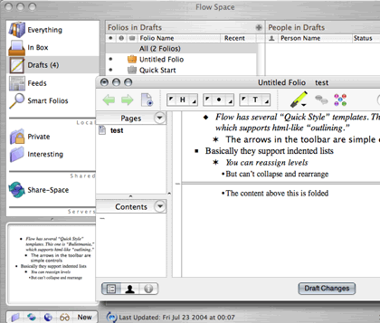
No sooner was the virtual ink dry on last month’s column than a new outliner of sorts appeared: Near-Time Flow. It is targeted at distributed, Web-based teams and serves as a knowledge base for content for complex projects together with management information about the project. Like all the products that are just appearing in this space, it is strongest in brainstorming and weaker in actual project management.
Flow is a very ambitious product based on the idea of concurrently edited distributed documents that have structure. You need to subscribe to their Web service for the collaboration to work over the Web or you can locally leverage Rendezvous.
We mention it because the client includes a group-editable rudimentary “quick” outliner (basically HTML lists without collapsing). More interestingly, it features a general folding function, quite apart from the outliner. You select any block of material and simply collapse it to a bar. Unfortunately, there is no feedback whatsoever about what is collapsed.
Near-Time Flow
Formation
The first release of Formation has appeared. It is an interesting application in a few ways, advertised as an “integrated” personal information manager and idea organizer. It unifies (perhaps “integration” is too strong a word) several functions under one handy interface, and includes many more application types than I’ve ever seen. Unfortunately, that interface bears only a passing resemblance to an outline view. Until it allows more than one level, I’ll keep it off the official ATPO list.

Formation
Tasks
Last month we briefly surveyed Web outlining. We should have included Tasks available in a variety of forms from single to multiuser, donationware to subscription services starting at $4 per month. It is a Web-based outliner targeted at to-do lists. Check it out at the Web site. Dashboard may empower a whole class of applications like this.
Dashboard
Apple had its yearly developers’ conference in June, during which it previewed the next version of OS X, Tiger. Among the new features is something called Dashboard, a collection of desk accessory-like little applications that perform specialized functions with Exposé integration. Unfortunately, most of the discussion of Dashboard has focused on whether Apple unfairly “stole” the idea from Konfabulator, which it superficially resembles.
What’s being overlooked is that the Dashboard development environment is radically different. Dashboard widgets are dynamic Web pages! Yes, that’s right: Dashboard effectively brings browser-based applications to the desktop.
So our little excursion last month into Web outlining (not completely accidental, timing-wise) now takes on added meaning for ATPO readers. We soon will have the ability to host things like activeRenderer, webOutliner, Tasks, and similar things within the desktop. I expect a huge wave of innovation in the Internet-aware outliner space as this sinks in. The open-source Frontier may be a force here also. Watch this space.
Department of Corrections, Apologies, and Additions
In our review of SymmetryWorks last month, we said we couldn’t find where to download the demo. Stupid us; it is easily found as Artandia reminded us in a comment on that review. Sorry for that, but now you know where to go to play with this great thing for a while.
Next month: “Deep Tinderbox.” This will be our most ambitious column, so don’t be too surprised if we slip a bit.
![]() Copyright © 2004 Ted Goranson,
tgoranson@atpm.com. Ted Goranson has been thirty years in the visualization and model abstraction field. He is slowly beginning a new user interface project.
Copyright © 2004 Ted Goranson,
tgoranson@atpm.com. Ted Goranson has been thirty years in the visualization and model abstraction field. He is slowly beginning a new user interface project.
Also in This Series
- A Progress Report · February 2008
- Some Perspectives on the Worldwide Developers Conference · July 2007
- Writing Environments, Plus Two New Outliners · November 2006
- Examining New Business Models · September 2006
- Outlining Interface Futures · July 2006
- Outlining Workflows and ConceptDraw · May 2006
- Dossier and Outliner Web Interaction · March 2006
- Two New Outliners: Mori and iKnow & Manage · February 2006
- Styles Revisited, Video Features, and a Proposal · December 2005
- Complete Archive
Reader Comments (25)
Concerning OmniOutliner and OmniGraffle, the latest official word we have is this, incidentally in response to ATPO.
Best, Ted
I would have been interested on your perspective of where Shared Space would fit into your mindmappers. It's been pretty low on the radar -- the last I've heard anything about it was almost 12 months ago. It was at v2.0b2 (beta) last September. For all I know, the author may have abandoned the effort by now.
Thanks very much for all this work. The quality of this series is incredible.
Regarding Shared Space, the developer (Ben Copsey) is working on something that is related which we will report when appropriate.
Best, Ted
One of the things I like about ATPM is their professional journalistic standards. There is a real editorial process and a rather intimidating ATPM style guide. At least it is intimidating to me, but it seems to be focused on improving the reader's experience.
Every product has the relevant link the first time it is mentioned; you must have missed these. We are considering repeating the link when a section header begins a focus on a product. How's that?
Best, Ted
You canot save anything using the trial. I found this out the hard way testing it out on a short term project. All my data is there now but I cannot restart my computer until I copy and paste each cell into something else. I was pretty upset that there was no information about this before setting out since that't not how trial versions usually work.
So you don't want to actually try using it when you do the trial. Instead I suggest just playing around.
http://www.versiontracker.com/dyn/moreinfo/macosx/24325
ActionItems
their website:
http://www.sailalong.com/
Ted, it seems outlining use in project managers is gaining strength lately as we have three new promising apps in this category: Flow, Process, and now ActionItems
With these new entries perhaps you could to a comparative review of them along with the other to-do apps OmniOutliner, Schedule, Slacker, Brainforest Deluxe, LifeBalance, and DayLite.
This is becoming a crowded field with many of these being strong commercial Cocoa apps in the $30â??150 range (Flow, ActionItems, DayLite, and Omni) with some unique features taking full advantage of OS X.
The leading contender for the November column is to do list and task managers, as you suggest. Thanks for the heads up on ActionItems.
Best, Ted
One mind mapping tool you missed is actually the market leader, Mindjet MindManager. We have more than 600,000 customers because we have a powerful, adaptable interface that meets the needs of creative thinkers, problem solvers and manager in the business community and academia.
We have designed our software on an XML code base and with an open API so that it is easy to use MindManager not just to organize your thoughts as these other tools do--but to hook into data sources and populate maps with that information.
Mind mapping is often thought of as a way to capture ideas. But often, what needs to be done is to take existing information such as that coming from a database, visualize it using the map interface, and then INTERACT with that data in a more natural way to form new knowledge.
There are an increasing number of mind mapping tools out there. The ones that are most useful are those that really understand the ways people want and need to manage an ever-growing number of sources of information and ideas.
We at Mindjet think we have a good (not perfect, but good and getting better) understanding of the business and academic value of mapping. I'd be happy to get you a complimentary copy of MindManager Pro 6 if you would like to see for yourself.
Thanks,
Hobie Swan
Mindjet
Thanks for the reminder. let us know when you have a version for the Mac.
Best, ted
Thank you for your ressources on mind mapping software,
on www.petillant.com , you can find anothers software for instance Thinkgraph (free), or in few days another software called I-navigation from Romania with beautiful hyperbolics curves as links .In English, it's soon available on www.exswap.com
Best regards
A.R.
Regards, Martin Turner
http://www.martinturner.org.uk
Regards, Ove Pettersen
Oslo, Norway
Here is the press release:
http://www.mindjet.com/eu/company/press_center/about_press_news_release.php?s=1&release_id=05312006
Other links:
http://www.mindjet.com/eu/ [Europe]
http://www.mindjet.com/us/ [US]
http://www.mindjet.com/us/products/mindmanager_6_mac/?s=6
Short review:
http://www.it-enquirer.com/main/ite/more/mindmanager_6_mac/
News coverage:
http://www.topix.net/com/mindjet?full=4e6c803d3d
It is not PRECISELY a mindmapper, tho it can create them, and it has the same function. very very powerful and enjoyable to use.
for mac and pc
http://www.compendiuminstitute.org/about.htm
Thanks.
--Ted
Add A Comment