Review: SmoothType 2.1

Product Information
Produced by: Gregory D. Landweber
Web: http://kaleidoscope.net/greg/smoothtype.html
Shareware Fee: $10
System Requirements
68020 Processor (68040 or PPC recommended)
System 7 or higher
16 grays or 256 colors (thousands of colors or more recommended)
80 dpi or higher resolution recommended
Adobe Type Manager required to anti-alias Type 1 PostScript fonts
A long time ago in a galaxy far, far... wait, that’s not till later this month. What I was trying to say is: a long time ago, when the Mac first came out and dot matrix printers ruled the land, what you saw on the screen looked either the same as or better that what came out of your printer. First, laser printers worked their way down from desktop publishing into many homes and businesses. Now, almost every computer sold comes, at the minimum, with an inkjet printer capable of printing at 720 dpi, making the 72 dpi resolution of your monitor look downright paltry in comparison. Short of having 720 dpi monitors, anti-aliasing is the best technique to make fonts on the screen look more like the printed page. Anti-aliasing blurs the edges of the text by changing black pixels to shades of gray.
SmoothType is a control panel that allows you to use anti-aliasing on your Mac. When it first came out, SmoothType was the only product of its kind available. Since then Mac OS 8.5 has added this ability to the operating system. SmoothType and Mac OS 8.5, however, take different approaches to anti-aliasing, and therefore produce slightly different results.
The SmoothType control panel has several different options. The first allows you to choose between 2- and 4-bit anti-aliasing. Four-bit anti-aliasing produces the nicest results but takes slightly longer to render the text. 2-bit anti-aliasing renders text the fastest, but at the expense of quality. On a G3, the difference in rendering time is not noticeable. The difference in quality, however, is easily noticeable. I am unable to use 2-bit anti-aliasing for an extended period of time. Before I using a G3, I had an older version SmoothType installed on a Performa 630. Even given the extra processor hit, I chose to use 4-bit anti-aliasing.
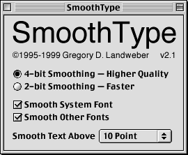
The remaining options allow you to chose when and where anti-aliasing will be applied. They are fairly self-explanatory. The only confusion occurs when determining the boundary between system fonts and other fonts. For instance, the options in the SmoothType control panel (radio box options, check box options, and a pull down menu) are system fonts, while the SmoothType logo is another font. For the best results, both of the anti-aliasing options should be turned on. As for the minimum size text to anti-alias, SmoothType allows you to go down to anything above 9 points. In general though, anti-aliasing text of 12 points or less yields difficult-to-read results.
SmoothType and Mac OS 8.5 generate anti-aliased text differently. Choosing between these styles is a matter of personal preference. Below are examples or normal text, SmoothType anti-aliased text, and Mac OS 8.5 anti-aliased text.

No Anti-Aliasing

Mac OS 8.5 Anti-Aliasing

SmoothType 2-Bit Anti-Aliasing

SmoothType 4-Bit Anti-Aliasing
While I was reviewing SmoothType, I ran into an anomaly I have not been able to reproduce. The third line in the above samples, Old English Text MT, constantly disappeared whenever 4-bit anti-aliasing was used in SmoothType. I was switching between normal text, SmoothType anti-aliasing, and Mac OS 8.5 anti-aliasing at the time; and whenever I selected 4-bit anti-aliasing, the text disappeared. A restart fixed this problem, but it was disconcerting, to say the least.
If you are using OS 8.5 or higher, I suggest you stick with the built-in anti-aliasing, unless you vastly prefer the look of SmoothType’s. I cannot justify purchasing a piece of software that duplicates already present functionality without somehow advancing the already present features. Aesthetic differences aside, SmoothType does not do that. If, however, you are using some variant of System 7, I would recommend SmoothType.
![]() Copyright ©1999 Eric Blair eblair@atpm.com. Reviewing in ATPM is open to anyone. If you’re interested, write to us at reviews@atpm.com.
Copyright ©1999 Eric Blair eblair@atpm.com. Reviewing in ATPM is open to anyone. If you’re interested, write to us at reviews@atpm.com.
Reader Comments (2)
Add A Comment