Quick Tips in Design
Part 1: Using Value
Most people recognize good design when they see it, but even those trained in design often get “in a rut” and need a different perspective once in a while. These articles are based on the foundations and principles of basic design. Anyone can go out and buy a book on basic design principles, so instead we’re going to show you more visual, real world examples of ways to apply these techniques.
Design principles are based on the way the human brain processes visual information. Depending on your desired results, you can use these techniques to change how the viewer reacts to your work. It should be noted that most of the basics of design are based on human audiences, and will have different results when viewed by cats or extraterrestrials.
Shades, Value, and Gradations
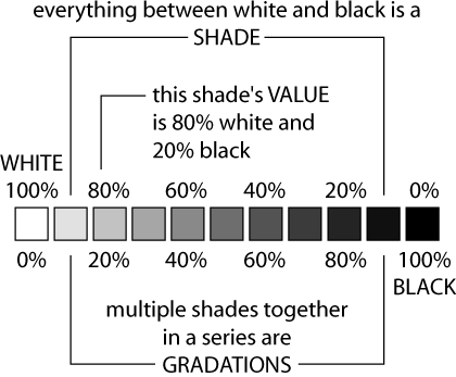
A shade is a combination of white and black to produce a particular shade of gray. All of the shades of gray between white and black are values, and when used together are also called gradations. Computers have made using value easy, with straightforward and evenly mixed values presented on a nice gradation scale.
So what’s value good for? Value is great for suggesting volume, creating spacial effects, changing mood, creating visual interest, and changing impact.
Contrast
Contrast describes the range of gradation between different values.
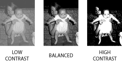
A balanced image will have the most values between white and black. A high contrast image has fewer gradations. A low contrast image is missing the ends of the spectrum, white and black and the values closest to them.
High contrast is often used for greater impact; lower contrast can quiet things down and even create harmony.
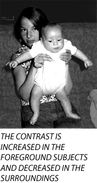
Increasing the contrast of objects in the foreground of an image, and decreasing the contrast of objects in the background, can create more spacial effects. In the image below, the contrast was increased on the people and decreased on the background, giving the image more spacial impact and emphasizing the subjects.
Suggesting Volume and Space
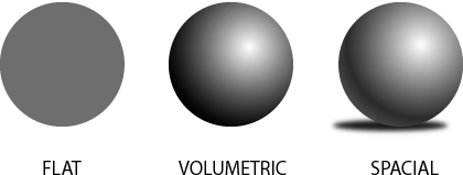
What’s the difference between drawing a circle and a ball? Value. Because of the way the human brain interprets the world, value can be used to create the illusions of volume and space.
People naturally interpret that lighter values indicate a light source. By using shading our flat circle is instantly given volume, and becomes a sphere.
Shading and value can also be used to create shadows, further adding the suggestion of space and volume. Without shadows the sphere is floating in space. Lighter changes in value are also used at the far right edges of the sphere to suggest that light is being reflected back from a surface.
Why does the sphere with shading work to represent volume and space? The shadow matches the shape of the sphere and the shadow is off-centered to the left to match the direction of the “light source” which appears to be coming from the top-right. If the shadow were dead centered beneath the sphere, it wouldn’t match the lighting direction and would be less convincing.
Problems with drop-shadows or combining multiple photographs into one image are often caused by the light-source not matching the shading and shadow.
Using Value to Create Balance and Visual Interest
Here is a way to use value to spruce up a letterhead and even create an identity and logo by using value changes. The Department of Physics, Computer Science, and Engineering is often identified with the acronym PCSE.
Using Helvetica Neue Bold Condensed, we created a the first line at 72 points and the trailing text at 14 points. These point sizes create a dramatic presentation and added visual balance by generally matching the width and height of PCSE to the following text.
But something is still missing.
The 72 point PCSE type is visually much heavier than the following text and feels somewhat top-heavy. Why not balance the top-heavy text by lightening the value? Instead of black text, we’ll make it mid-gray.

Lightening the value of the large PCSE makes it more balanced with the other text. But it isn’t very interesting.
Leave the first letter 50% gray, but let’s change the rest. Make the C and E lighter and the S slightly darker.

Using the basic design principle of value, mixed with two type sizes, and we’ve got a department letterhead and logo that can even be created in a word processor.
Psychology and Value?
Value and contrast can also be used to change the mood of an image or design. A good example is old vampire movies and how the underexposed and dark scenes created a sense of danger. The next time you watch a horror movie or a sci-fi movie with a bleak subject, notice how the use of darker values and contrast are applied throughout the movie to affect mood. From the very beginning of the movie the titles will often use value as a technique to set the mood for the audience. It wouldn’t be a good idea to use that technique when trying to create an advertisement for laundry detergent.
Another time to avoid using many darker values is when creating a presentation for a lecture, since excessive use can lead to a cranky and disinterested audience. An audience can actually be encouraged to pay more attention by slightly tweaking images to create higher contrast (just don’t go overboard).
On the flip side, value can be used to create a more soothing and relaxed effect. Look for this technique in television programming that is targeted to calming viewers. Some instructional, gardening, home-oriented, and “feel-good” shows tone down the contrast, especially the extreme lights and darks.
Value is just one of the basics for creating good design and modifying images. In Part 2 we’ll discuss color and simple ways to use color to help with your images and design.
![]() Copyright © 2003 Andrew Kator,
akator@atpm.com.
Copyright © 2003 Andrew Kator,
akator@atpm.com.
Also in This Series
- Part 8: Pattern · February 2004
- Part 7: Type as Shape · January 2004
- Part 6: Color Science · December 2003
- Part 5: Shape · November 2003
- Part 4: Line · October 2003
- Part 3: The Illusion of Depth · September 2003
- Part 2: Using Color · August 2003
- Part 1: Using Value · July 2003
- Complete Archive
Reader Comments (10)
Thanks,
Jim
Unfortunately because of publishing restrictions, I am unable to continue the series until I get permission while waiting a publishing contract. If anyone works for a "non-vanity" publisher that would be willing to publish the book and allow me to continue with these articles, please let me know.
Faking reflections: http://drawsketch.about.com/gi/dynamic/offsite.htm?zi=1/XJ&sdn=drawsketch&zu=http://elfwood.lysator.liu.se/farp/metal2/Reflective1.htm
Rivers, lakes, and ponds: http://www.geocities.com/~jlhagan/advanced/rivers_lakes_ponds.htm
The many 3D tutorials available might help demonstrate what needs to be done for realistic glass. Try searching for "glass reflections transparency caustics".
Sometimes we expend hours trying to make a good image and small tips like this can help us use better our time.
Excellent !!!
Tio Ilmo
São Paulo - Brazil
Everything is clearly and logically explained in the right sequence. Thankyou.
Add A Comment